


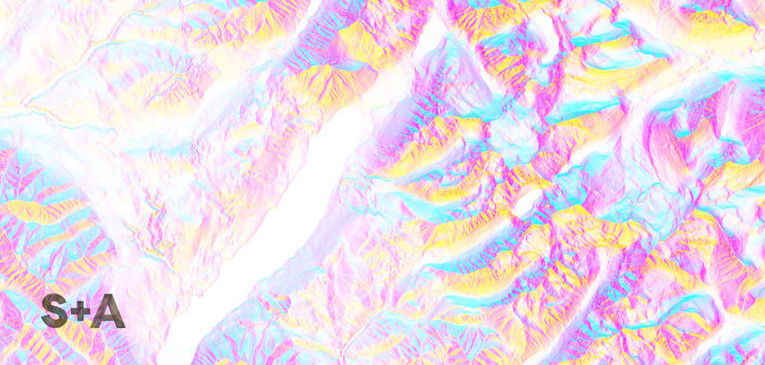
 Detail of a Slope + Aspect map of Glacier National Park
Let me introduce you to my good friend, the very talented Tim Sinnott. A true renaissance man, Tim is a consulting cartographer by day, and a cartographic artist by night. After years of obsessive geographic data-tinkering, Tim recently launched a print shop called Slope + Aspect, where he is exploring, designing and selling prints of his artistic interpretations of maps. But these aren’t any old maps; they are intricate, abstract representations of some of the world’s most unique and beautiful places, made with minimal data and color. About the images, Tim says “These maps reside at the intersection of art, utility and place. I have designed them for your walls, and while you may be able to locate yourself in their content, they will not help you find your way home (though you’re welcome to give it a try).” The images are, indeed, incredibly interesting to get lost in. Oh, and did I mention that they’re also gorgeous?
When Tim asked me if I would help him refine a logo direction for Slope + Aspect, I was super pumped. He came to me with a clear vision for a clean, bold, simple, modern logo, but wanted to add a more organic, hand-crafted feel to it. His intention was to have the logo printed on the lower corner of each of the map prints, so we knew it had to feel in sync with the aesthetic of the art, but also retain an edge that would help it stand out on its own.
My first round of drawings for Tim included twelve versions of hand-lettered logos taking off from the starting point he gave me, as well as a bunch of minimal, three-part color palettes. As we refined the options, we were both surprised by our strong preference for the graphite versions of the logo that you’ll see below. It’s true what they say- sometimes that first sketch ends up being the best one.
Have a look here at Slope + Aspect’s final hand-lettered logo, the sketches that got us there, color palettes and more. And don’t forget to check out the incredible maps for sale over at Slope + Aspect. You can also contact Tim directly to inquire about custom map orders at slopeandaspect@gmail.com.
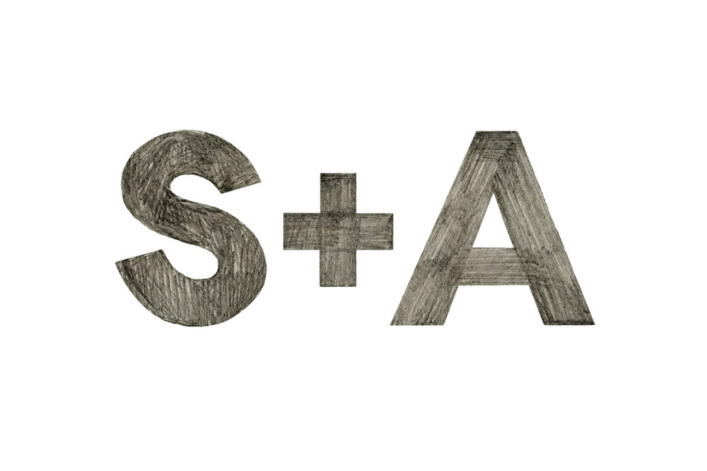 The final hand-lettered logo for Slope + Aspect
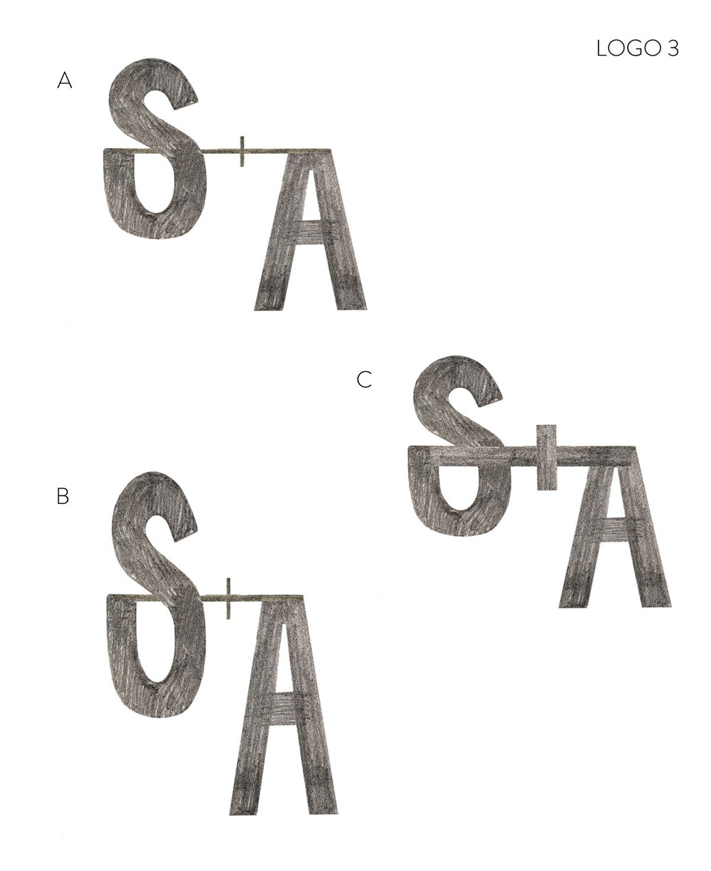
 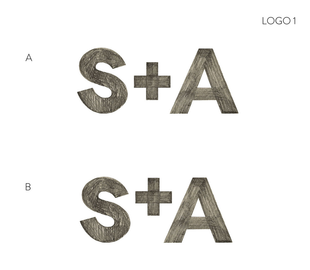 Sketches for Slope + Aspect’s Logo
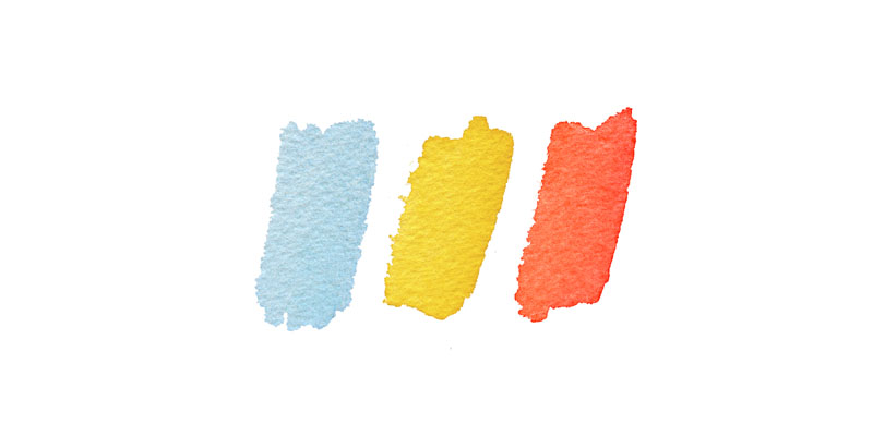
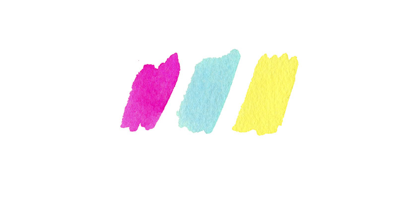 Sample color palette sketches
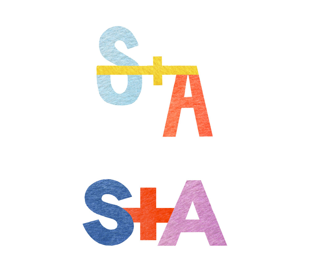
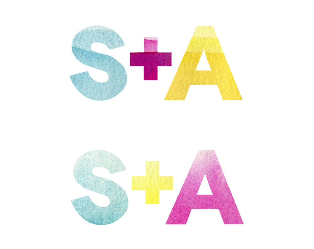 Logo skeches in color
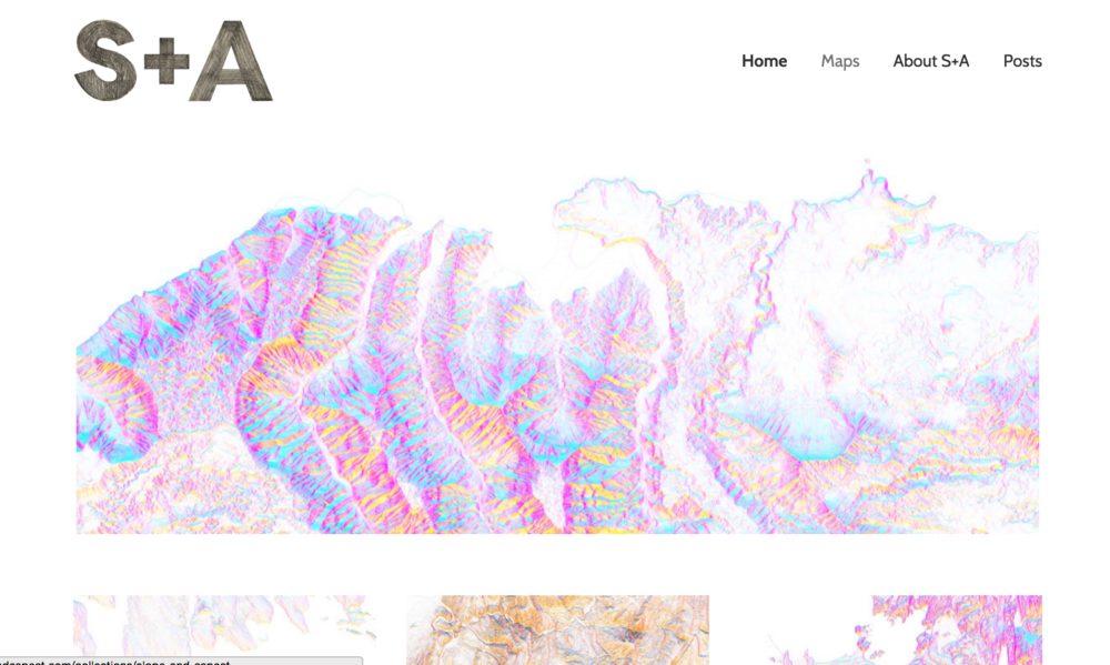 Screenshot of the Slope + Aspect’s landing page
 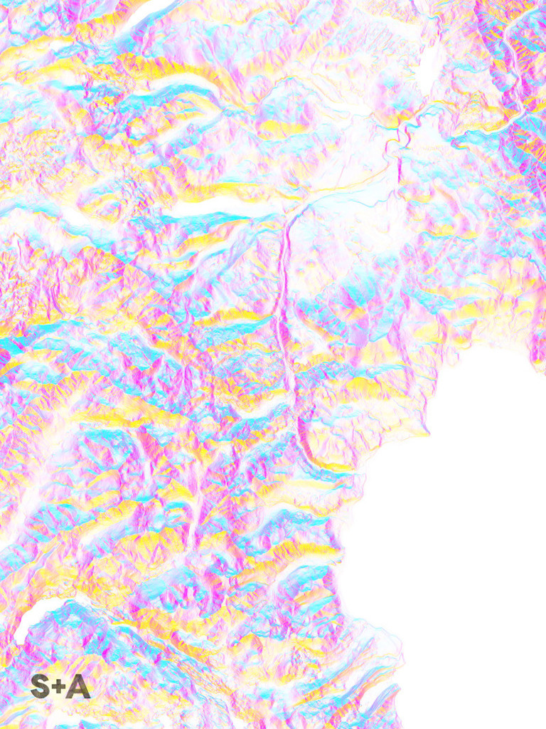 One of Tim’s gorgeous full-scale map prints. This one is of North Lake Tahoe, available for purchase HERE.


ADD A COMMENT