


Hi Friends! It’s been long time since my last post. It’s good to be back!
Earlier this year I had the pleasure of working with the incredibly talented and thoughtful photographer, Martha Swann, on recreating her logo and branding. As you can see from her work, she has a brilliant eye for color, light, and gorgeous composition, so she was a dreamy client to work with.
Martha came to me prepared with inspiration images, a mood board and an open mind. When I told her I had never done a branding or logo project, she didn’t shy away! I have always wanted to do branding and logos, and as predicted, I loved the collaborative process from start to finish. It was completely energizing to discuss Martha’s vision and goals for her business, and fascinating to think about how I could translate descriptive words that came out of our conversations (such as “understated,” “organic,” “clean,” “hand-crafted” and “earthy”) into a visual message that would communicate her values and approach. It was challenging, fun, and super rewarding. Since then I’ve worked on a second exciting identity project (more to come on that one soon!) and have another lined up for this summer.
Take a look at these images of Martha’s new logo, color palette, and more.
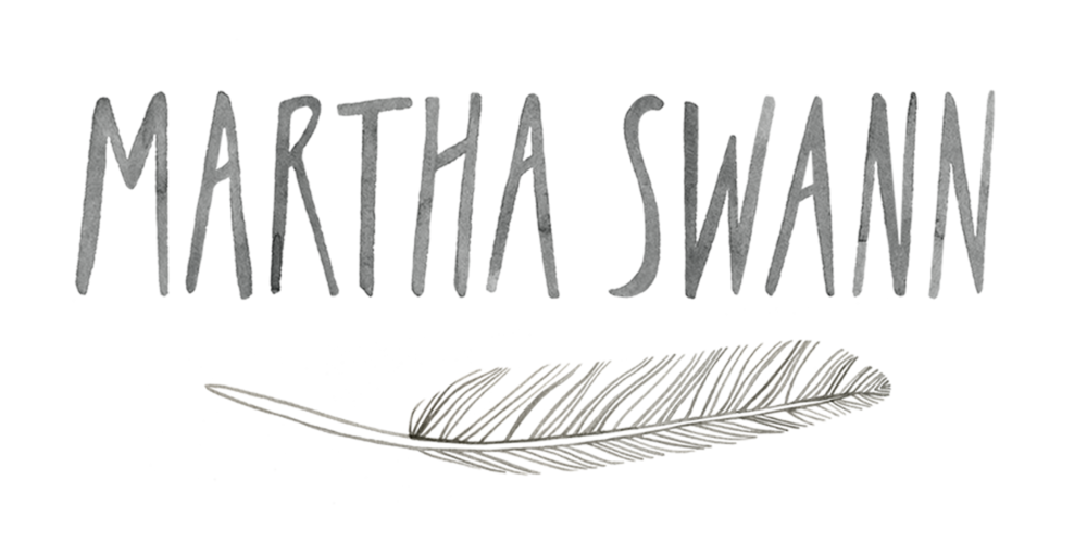
Martha’s final logo shown here in greyscale
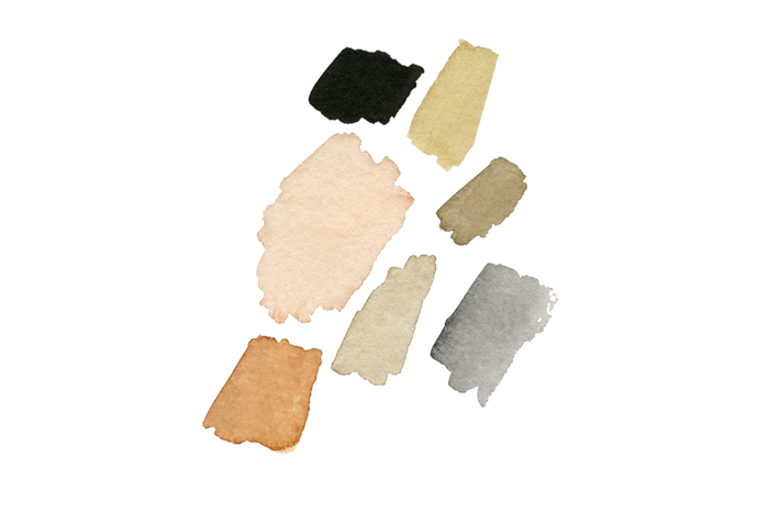
The earth tone- inspired color palette I developed for her overall branding
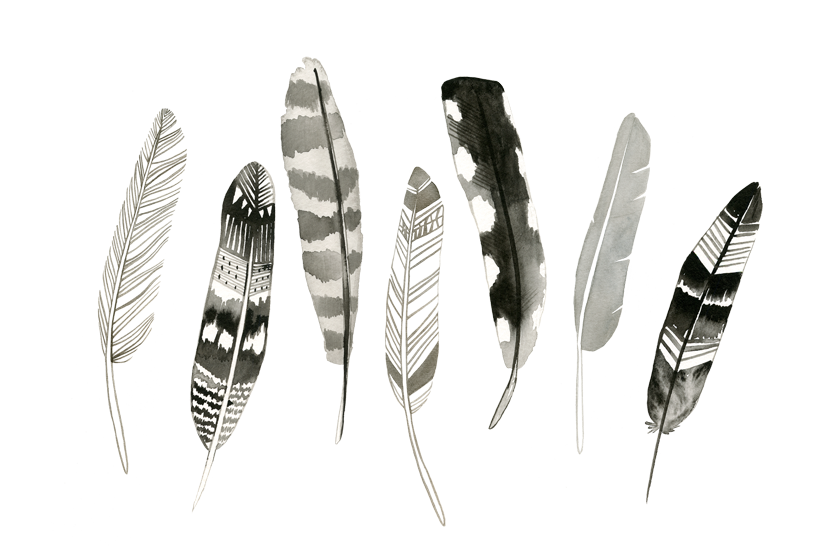
Lots of feathers! Martha is using the one on the far left for her primary logo, but plans to incorporate the other feathers in her future branding and packaging.
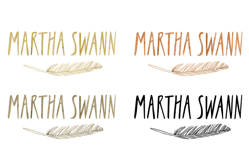
Logos in color!
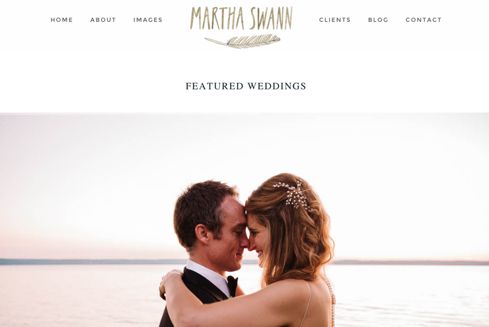
And finally, her logo in color, incorporated into her new website. Check it out for yourself HERE !


ADD A COMMENT