From August through October of this year, I participated in Lilla Rogers’ Global Talent Search, a multi-phased competition that illustration agency Lilla Rogers Studio holds annually to find the next artists they will represent. This year, the Global Talent Search attracted 1,000 entries from around the world.
My work was chosen to move on after the first and second rounds of the competition. I was thrilled to be chosen as one of six finalists and move on to the third and final stage!
The finalists’ task was to create art based on one of four trend board given to us, and to develop a line of home decor products using our art. I chose a board called “Welcome Home” because it looked like an opportunity to use strong contrast and hand lettering, as well as draw quirky San Francisco architecture – something I’ve loved drawing in my sketchbooks over the years. It was a super exciting and challenging assignment, precisely because it could be taken in so many directions. I tried to stay focused on dreaming up art and products that I could imagine in my favorite shops, and my own house.
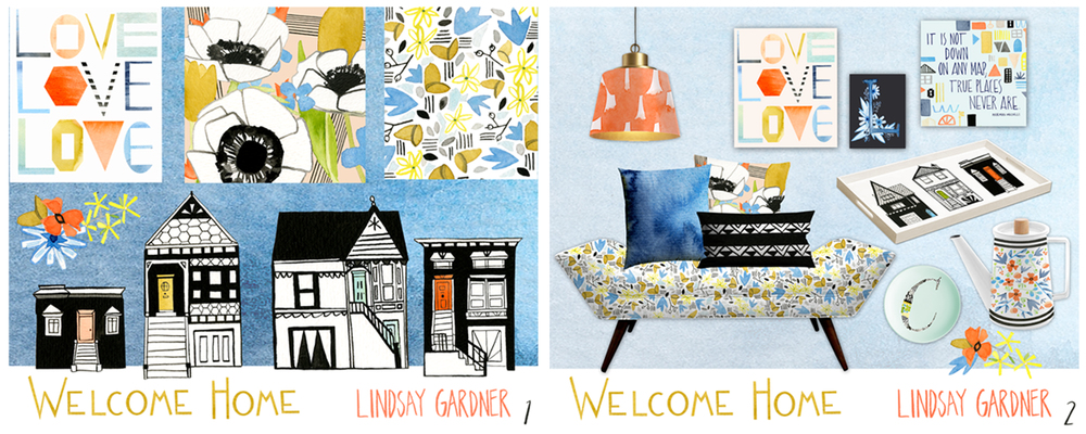
Here is my final work.
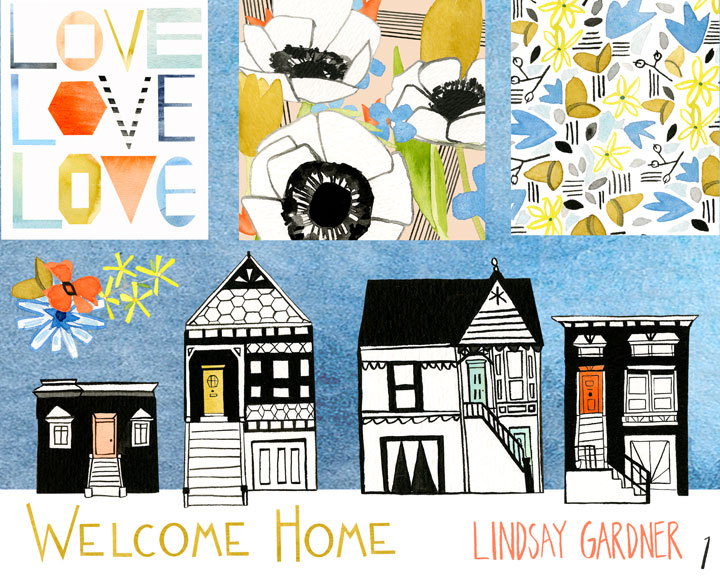
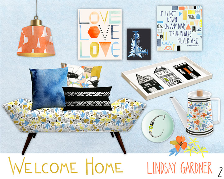
Though I did not ultimately win (Congratulations Tara Lilly, Flora Waycott and Rebecca Jones!), I am glad that I participated and I was honored to be chosen as a finalist. I learned a lot in the process, and I received amazing exposure for my work and kind feedback along the way from so many of you. Thank you!
The Process
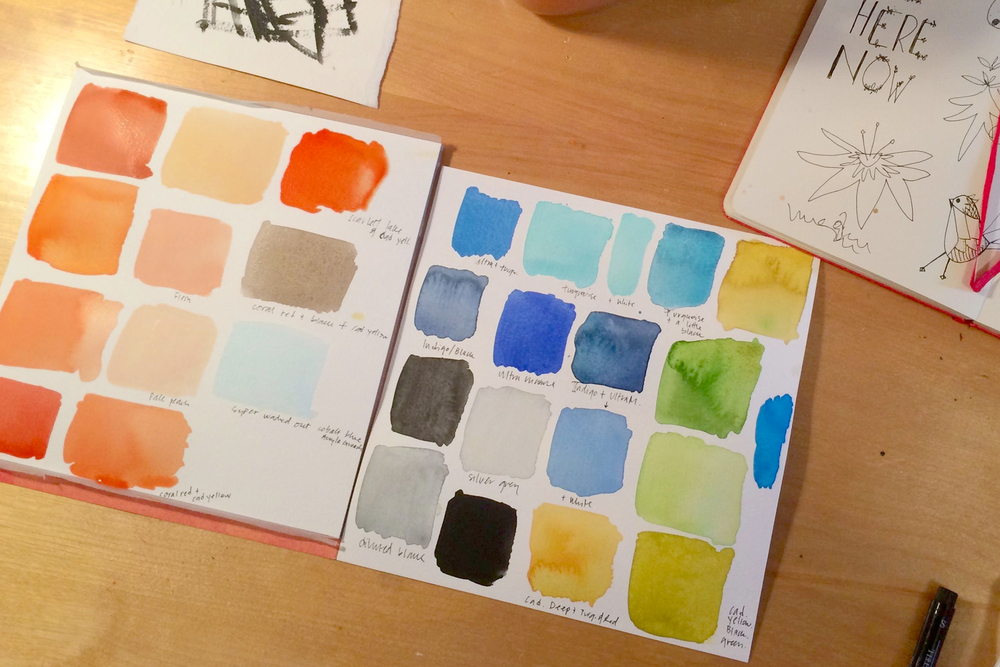
I started by gathering reference material, going on walks in my neighborhood for inspiration, and thinking about color. Then I sketched rough ideas and decided on a color palette. I always have to mix colors and see them on paper before I can figure out which way to go. Here is how I started to mix and notate colors for this assignment.
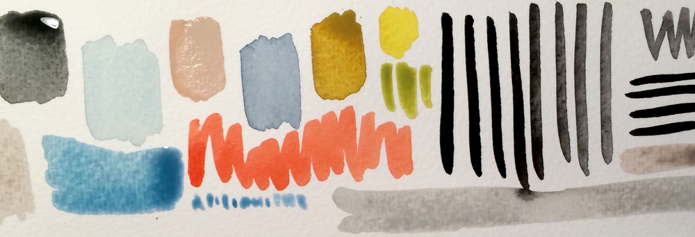
And here is my final color palette, which I used as the basis for the rest of my work.
I knew from the beginning that I wanted to include a lot of strong geometric patterns for my home decor line. I also wanted the shapes from my house drawings to carry through the other illustrations and tie together different components of the overall line. So, I started by drawing houses. Then I expanded on the geometric patterns and kept working them further.
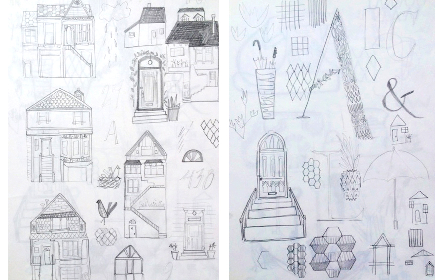
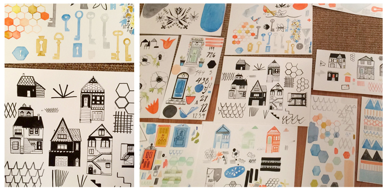
Eventually I started to paint from the sketches. When I paint, one thing leads to the next, and that was especially the case with this work. I’d paint a house in ink, then make a hard-lined geometric pattern next to it, which would carry over to the next page in a washy watercolor version of the pattern.
Once everything was scanned and cleaned up, I played with scale and pattern combinations and mocked up my work on different kinds of products. Finally, after many hours of tinkering, this was my final presentation.
ADD A COMMENT